Explore 31 Maps That Expose Unexpected Facts About Everyday America
See how simple visuals uncover surprising details about life in every state.
Some maps don’t just show where things are, they expose what’s been quietly shaping everyday life in America. One minute you’re staring at “United States Population Lines,” the next you’re realizing the country’s story is written in colors, borders, and weird little patterns you never noticed before.
Take the “More People Live Inside The Red Area Than The Grey Area” map, it sounds simple until you think about what that means for schools, healthcare access, and even how often the “How Much Snow Does It Usually Take To Cancel Schools?” question turns into a real, stressful calendar problem for whole towns. Then there’s the wedding spending map, the dog versus cat states map, and the coastline from 100 million years ago that somehow still finds a way to echo into Alabama election results.
By the time you get to the tree cover map and the most common surnames by state, you’re not just looking at geography anymore, you’re reading people.
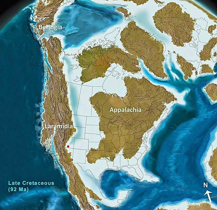
North America 92 Million Years Ago
 amazingmap
United States Population Lines
 reddit.com
Topography Of USA
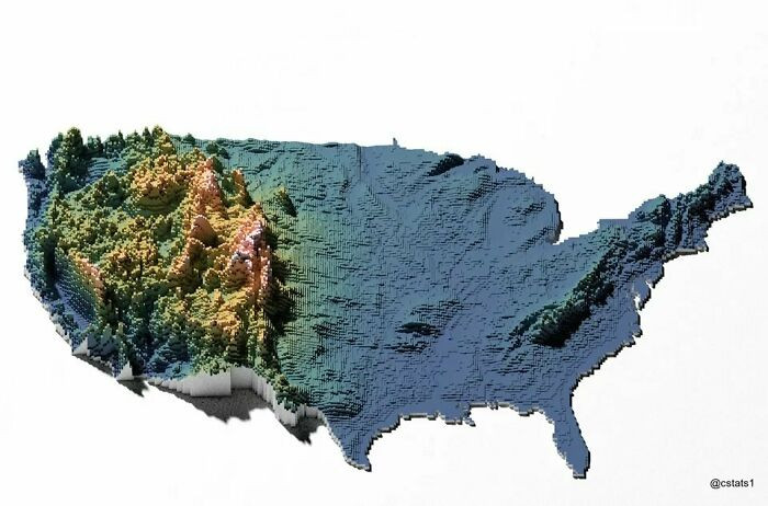 TotherCanvas249
The exploration of maps in this article sheds light on the multifaceted nature of America beyond its geographical boundaries. These visual tools do not simply present landscapes; they unveil the intricate socioeconomic patterns that define our communities.
The demographic maps featured illustrate stark contrasts, such as regions marked by significant income inequality and educational disparities. Such insights are crucial for policymakers, as they can harness this information to implement targeted interventions. This capability underscores the role of maps as essential instruments in urban planning and the equitable distribution of resources, ultimately highlighting their importance in shaping a more informed and responsive society.
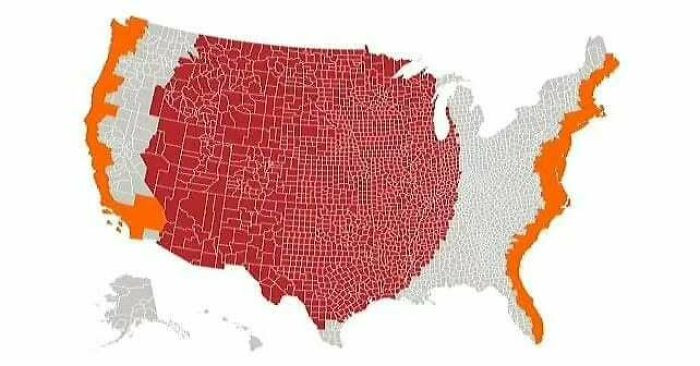
More People Live Inside The Red Area Than The Grey Area
 lex52485
Average Money Spent On Weddings In Us States
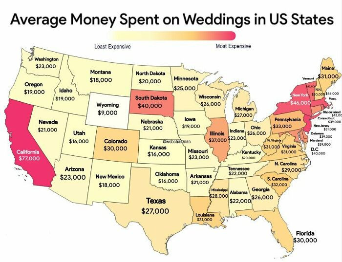 Starry_Night0123
Dog Owning States vs. Cat Owning States
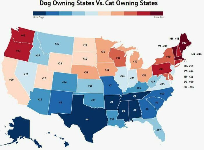 Thequietasober
Right after those “United States Population Lines” show up, the whole country starts to feel like it’s been sorted into categories long before anyone ever talked about it.
For instance, a map depicting health outcomes by region can help communities identify areas needing healthcare resources. This visual approach not only informs but also empowers citizens to engage in advocacy for local improvements.
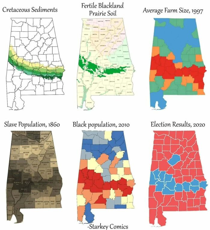
How A Coastline 100 Million Years Ago Influences Modern Election Results In Alabama
 amazingmap
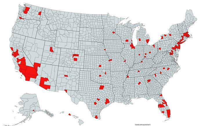
The Red And Orange Areas Have Equal Population
 amazingmap
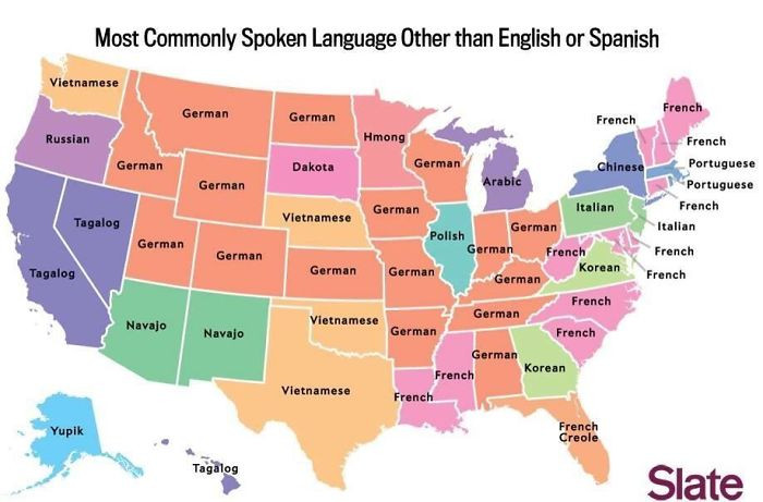
Most Commonly Spoken Language In The Us After English And Spanish
 reddit.com
Cultural Reflections
For example, a map showing the distribution of languages across the U.
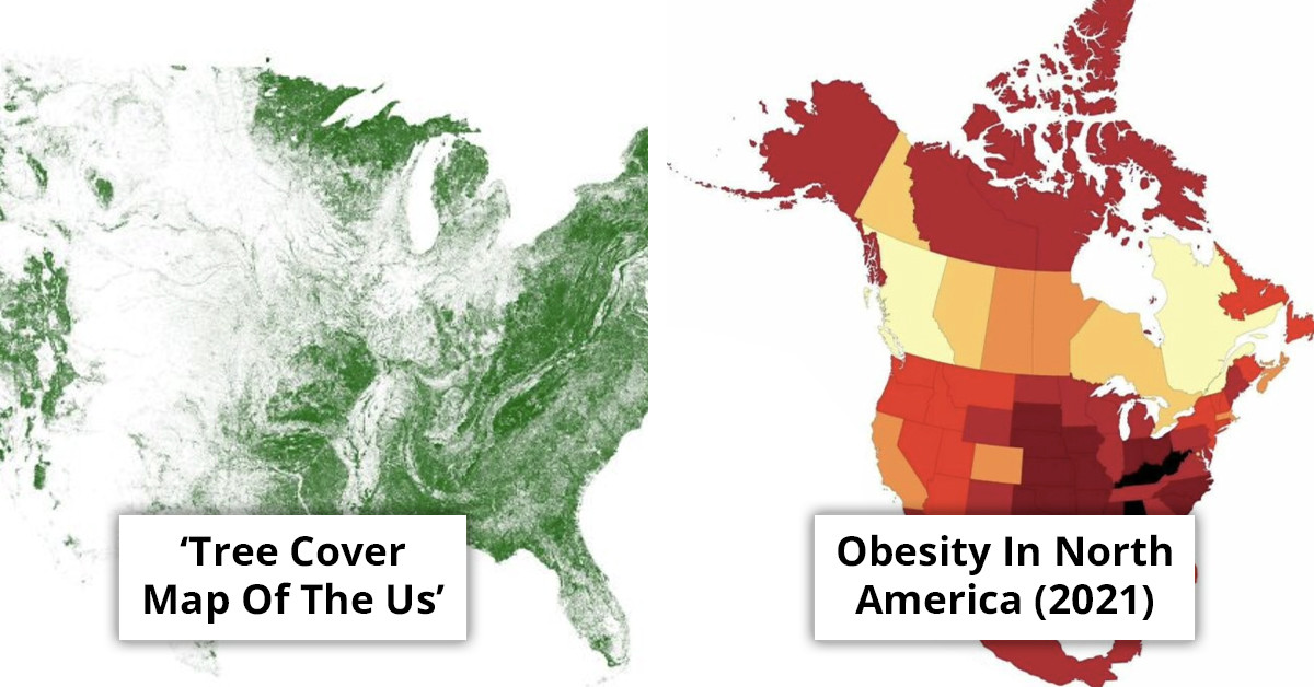
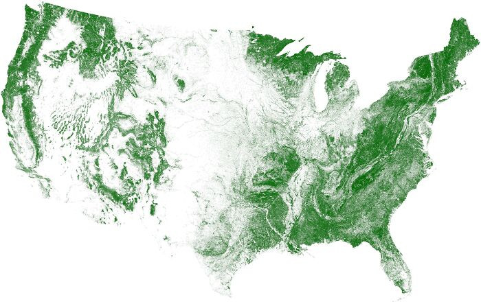
Tree Cover Map Of The Us
 DrWendigo
How Much Snow Does It Usually Take To Cancel Schools?
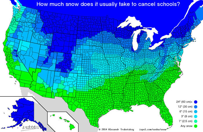 etymologynerd
Most Common Surname In The United States By State
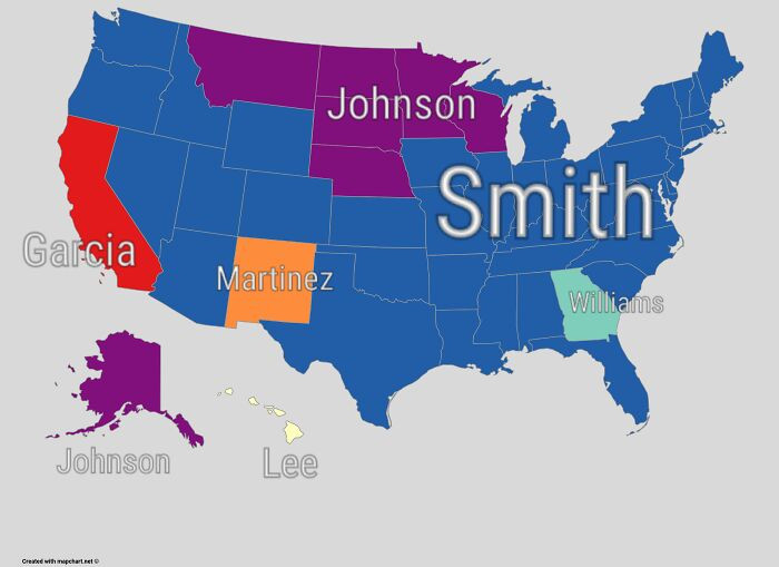 some_dawid_guy
When you hit the “More People Live Inside The Red Area Than The Grey Area” section, it’s hard not to think about how those same regions would ripple through education and healthcare needs.
Maps can serve as powerful teaching tools in classrooms. They help students visualize relationships between geography and historical events.
Incorporating interactive maps in lessons can enhance student engagement and comprehension, making subjects like history and social studies more relatable. Teachers should consider using digital mapping tools to encourage student exploration and critical thinking.
Abandoned And Out-Of-Service Railroad Lines
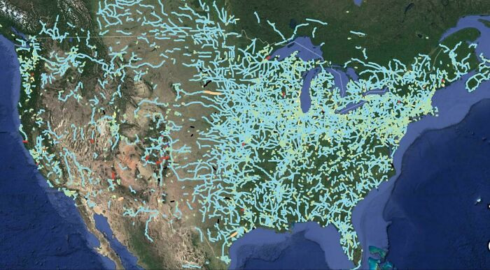 StrangeMorris
Map Showing The Loudest And Quietest Areas In The Us
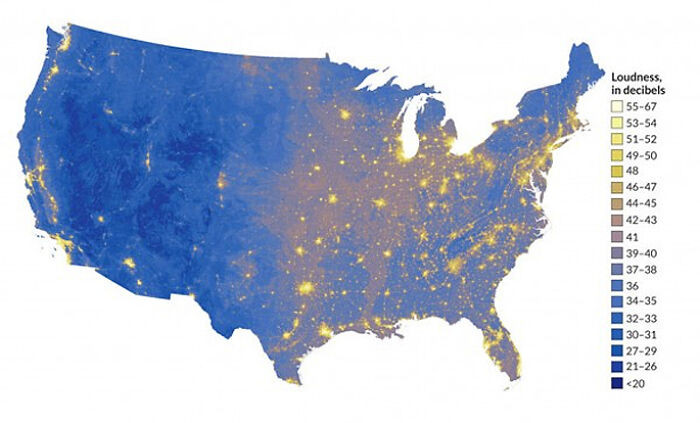 Knight1114
Virgin Forest Cover 1620 vs. Today
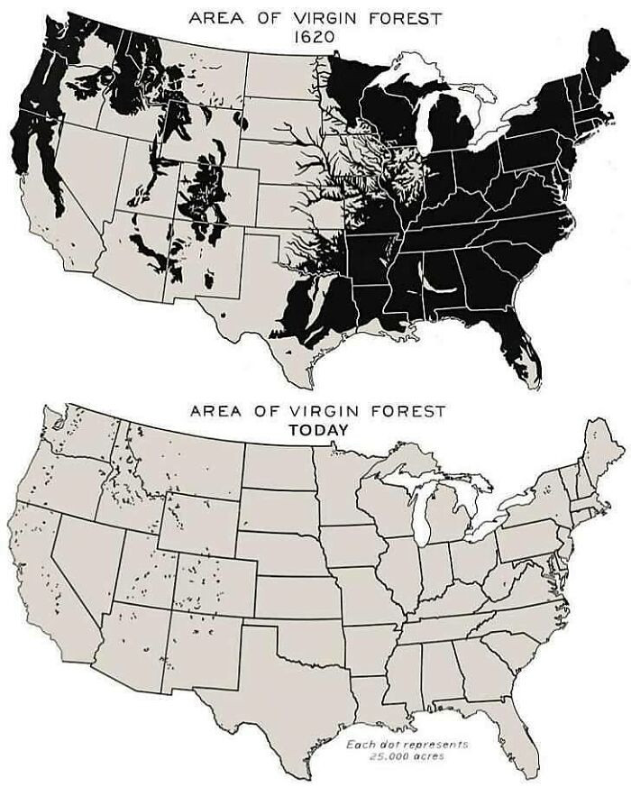 amazingmap
The article emphasizes the power of maps in revealing the intricate narratives woven through everyday America, particularly in relation to climate change. These visual tools can effectively showcase shifts in temperature and rising sea levels, driving home the urgency of the climate crisis. By illustrating these changes, maps can serve as a call to action, urging communities to recognize how climate issues impact their own environments. The integration of local data with broader climate models not only enhances public understanding but also encourages sustainable practices that resonate on a personal level. This approach transforms abstract concepts into relatable, tangible realities, fostering a more informed and engaged citizenry.
Speaking of marriage math, a careful saver bluntly refused to pay the fiancée’s college debt.
Obesity In North America (2021)
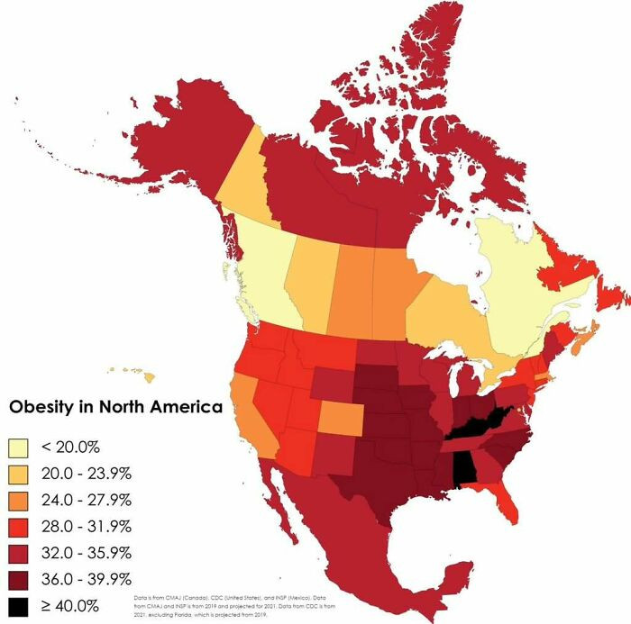 amazingmap
States With A Smaller Population Than Los Angeles County [960 X 606]
![States With A Smaller Population Than Los Angeles County [960 X 606]](https://static.dailysquared.com/posts/d58b155b32f8f74caf61bd3a82a7d14a_38965_700.jpg) SwiftOryx
SwiftOryx
Most Popular Dog By Us State
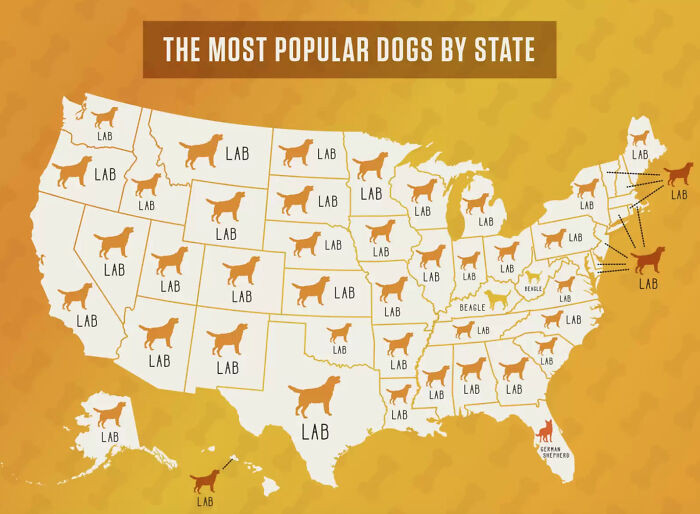 smooshedeggbog
GIS technology can help visualize patterns related to urban development, natural resources, and public health. By integrating these data layers, communities can develop strategic initiatives that address pressing issues effectively.
The United States Of America: Alaskan Perspective
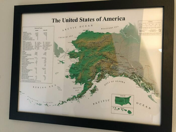 Pariahdog119
The Most Efficient Route Between Every Springfield In The United States
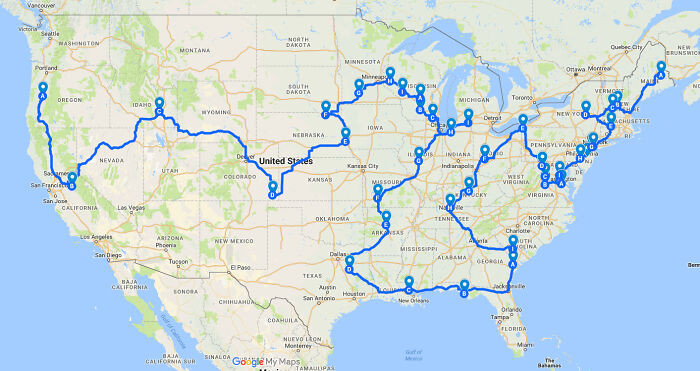 GreenMobius
Countries With Bases In The USA
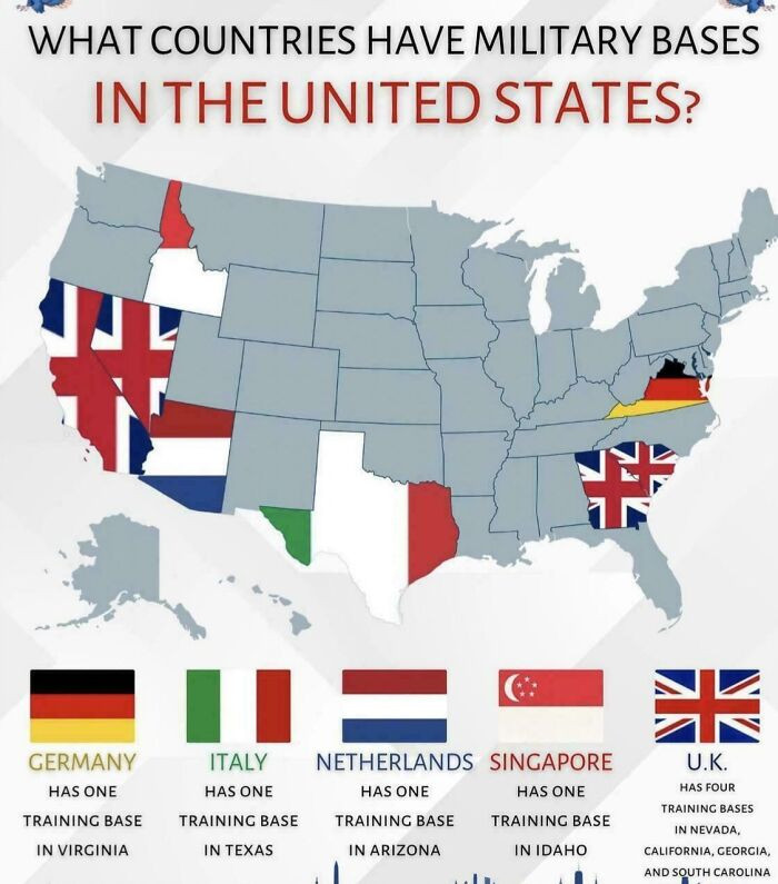 ActiveHelicopter6644
Then the “How A Coastline 100 Million Years Ago Influences Modern Election Results In Alabama” map lands, and suddenly you’re connecting ancient geology to modern voting moods like it’s a plot twist.
Economic Patterns
For example, identifying areas with high concentrations of tech startups can inform infrastructure investments and workforce development. Economic maps help to create a clearer picture of where resources should be allocated for maximum impact.
Us States Scaled Proportionally To Population Density
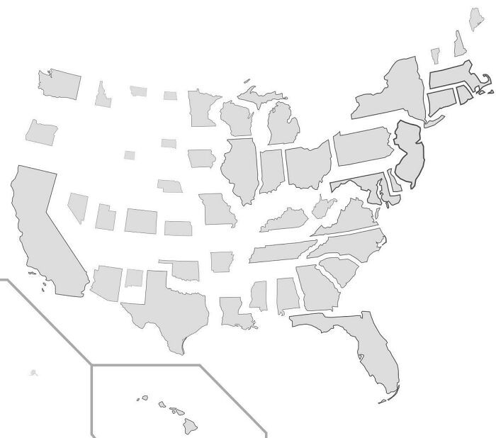 StarboardCapsized
Passenger Trains In The United States vs. Europe
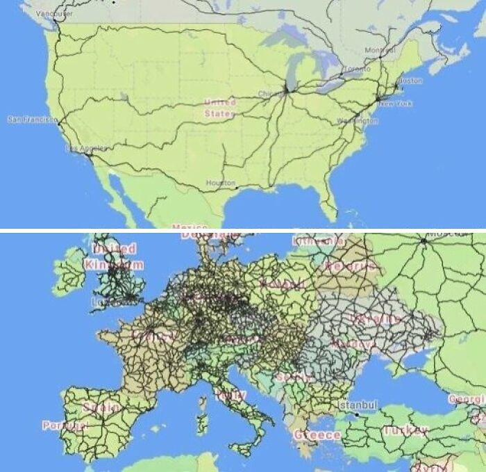 amazingmap
United States Gdp, Split In Half
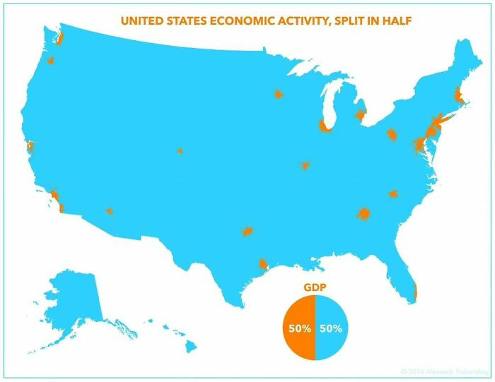 amazingmap
By involving local voices, maps can become more representative and reflect the true diversity of a community. This collaborative approach not only enriches the data but also encourages civic participation.
What The Great Pacific Garbage Patch Looks Like Layered Over The USA
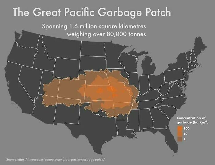 amazingmap
How IA Brit, See The United States
 DavidMcFarlanee
US Watersheds
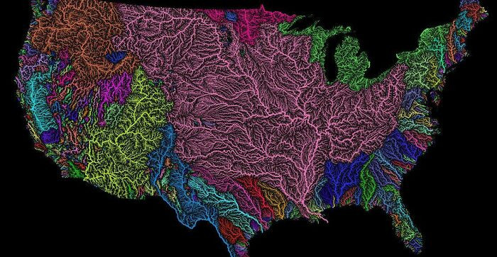 MrAllOrNothing
Finally, once “How Much Snow Does It Usually Take To Cancel Schools?” and the tree cover map collide, you get why these everyday details matter to real families, not just color-coded charts.
Technological Integrations
Advancements in mapping technology have revolutionized how we visualize data. The rise of interactive and real-time mapping tools has made information much more accessible.
These tools allow users to explore data dynamically, enhancing comprehension and engagement.
Light Pollution In The United States
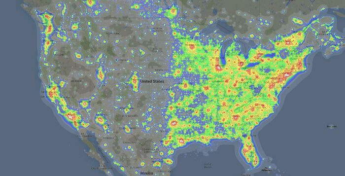 there_is_no_try
Average Color Of Us State Based On Satellite Imaging
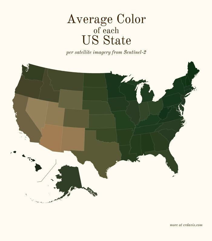 SnooMacarons8038
Us Racial/Ethnic Diversity Map
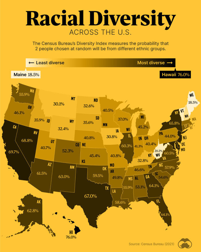 HtxCamer
Finally, teaching students how to interpret maps can foster critical thinking.
Historical And Current Grizzly Bear Range In North America
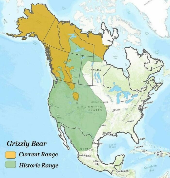 amazingmap
These maps show just how much there is to learn about the U.S. once you look a little closer. They reveal small habits, big contrasts, and all the unexpected details that shape everyday life from state to state.
Seeing these patterns side by side makes the country feel more familiar and more surprising at the same time. And the best part is that you don’t have to travel anywhere to experience it - sometimes a single map can teach you something new.
Maps serve as more than mere navigational aids; they unlock a wealth of insights into the complexities of American life. The article’s exploration of 31 maps reveals how these visual representations can inform education, influence policy, and enhance community engagement. Each map presents a unique narrative that invites us to reconsider our understanding of everyday America.
As we delve into the stories these maps unveil, it becomes evident that they have the power to reshape perspectives and inform critical decisions. By recognizing and utilizing the potential of these maps, individuals and communities can harness their insights to inspire positive change and foster a deeper connection to the world around them.
After these 31 maps, you’ll never look at “everyday America” the same way again.
For another “none of her business” showdown, read what happened when he refused debt disclosure.
Damjan